Saturday, October 22, 2016

New Artful Blog - Picture of Faith

Just popping in to let you all know that I have started a new blog called Picture of Faith.


I have recently been enjoying expressing my faith through art and have decided to share my journey on my new blog. This is the first painting I am sharing on my new blog.


Come and check it out by clicking the link above or in my side bar. Hope to see you there.

Wednesday, July 27, 2016

SOCC Week 8 Challenge - Distress Inks and Embossing Powders

Well here we are in the final week of Summer of Creative Chemistry. I am sad to see these challenges come to an end but I am excited to be part of Creative Chemistry 103 due to start August 1st 2016.
Unfortunately, I missed Week 7 as I was busy with another project using, you guessed it, fabric and Distress. I will feature my project in an upcoming post. I will still complete the Week 7 Challenge and post the page on my blog soon.
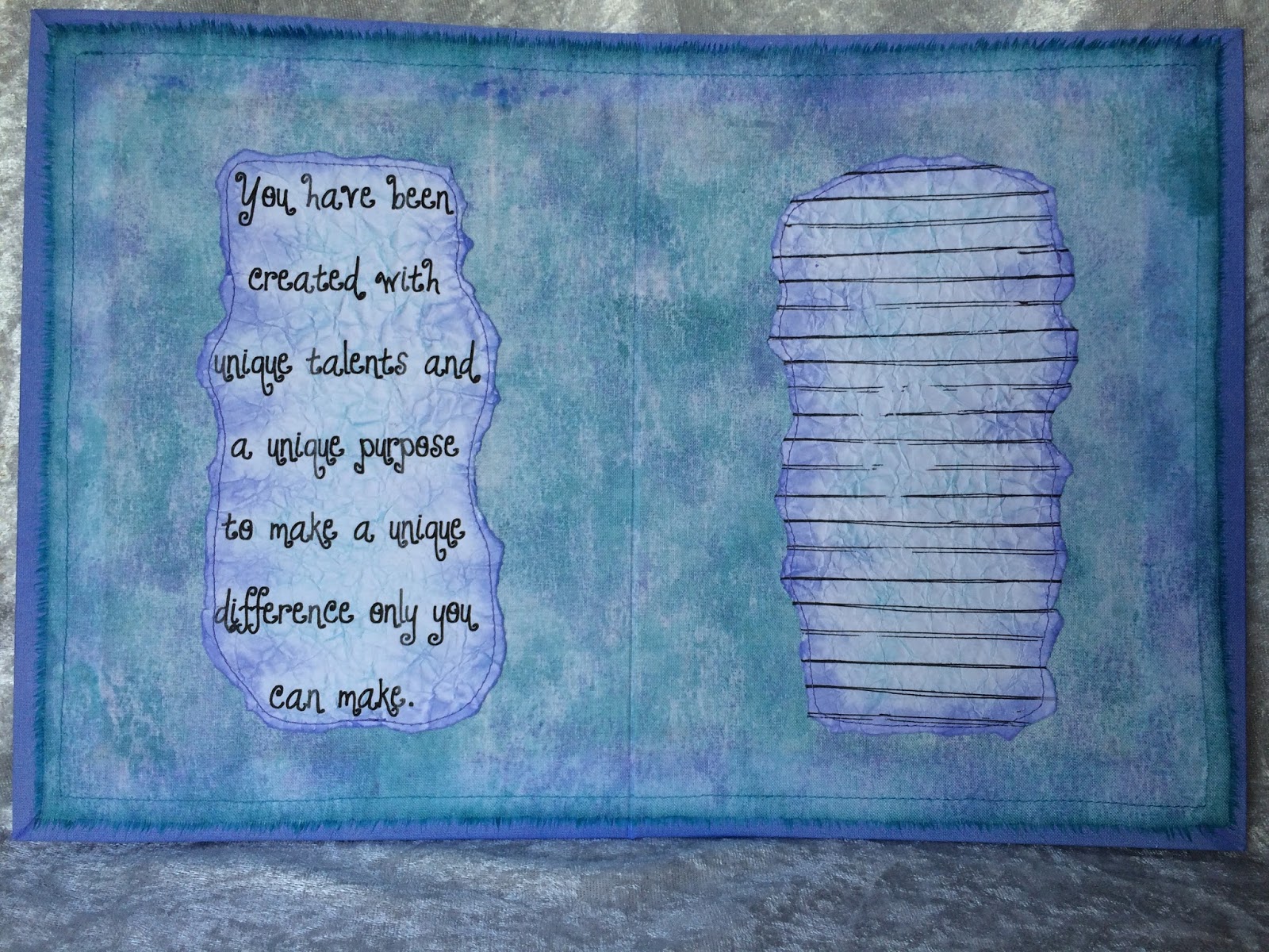
This week the challenge was to use Distress Ink and Embossing Powders. I chose Distress Embossing Powders as I love the varied effects I can achieve with them.


I have edged my base fabric layer with Dusty Concord Distress Stain.


I created my background by layering Scattered Straw, Wild Honey and Rusty Hinge Distress Inks. I sprinkled some Dusty Concord Distress Embossing Powder randomly over my background and heat set it with an iron under my fabric. I stamped the Kaisercraft "Script" stamp with Vintage Photo Archival Ink. I stamped the dots with a stamp from the "Bitty Grunge" set by Stampers Anonymous with Distress Embossing Ink and gold embossing powder.


I painted the vase with Rusty Hinge and Forest Moss Distress Paints. After adding some decorative stitching, I sprinkled some Vintage Photo Distress Embossing Powder over the Rusty Hinge and Clear Embossing Powder over the Forest Moss. I once again heat set with an iron under my fabric. I was going for a terracotta look. I also added some Clear Embossing Powder to the inner top lip of the vase to indicate glazing. I edged the vase with Walnut Stain Distress Ink.


I printed my words onto ordinary copier paper and applied Wild Honey Distress Stain over them. I sponged some Wild Honey Distress Ink around them. I grunged them up a bit and distressed the edges with Walnut Stain Distress Ink. I created the shadow for my words and vase with Vintage Photo Distress Crayon.
I coloured the stems with Forest Moss Distress Stain. The leaves were coloured with Crushed Olive and Forest Moss Distress Markers.
The flowers were created by colouring the petals with Dusty Concord and Wild Honey Distress Inks. I then edged the petals with watered down PVA glue and dipped them into Dusty Concord Distress Embossing Powder. I heat set them with my embossing tool and the glue bubbled up and caused some pretty cool texture. It also has the added bonus of sealing the edge of the fabric.


For the flower centres, I cut a circle and covered it with watered down PVA glue and Scattered Straw Distress Embossing Powder. I heat set it and repeated the process. The release crystals became trapped in the glue and embossing giving a wonderful texture. I pounced some Wild Honey Distress Ink over the surface to add some depth.
I have so enjoyed these challenges and the wonderful effects that can be obtained using Distress products and fabric. 
I am going to hold off constructing my book until after Creative Chemistry 103. I will be setting myself some more challenges as a result of those classes and adding those pages to my book.
Stay tuned for a belated Week 7 Challenge page!

Thursday, July 14, 2016

Happy Mail From PaperArtsy

I love receiving parcels! 


A big thank you to PaperArtsy for my wonderful prize for their recent blog challenge.
I am looking forward to playing with the Infusions range on my fabric pages. I will post my experiments when I have some free time. The colours are amazing!

Monday, July 11, 2016

SOCC Week Six Challenge - Layering Stencils

This week on Summer of Creative Chemistry the challenge was to use two of Tim's stenciling techniques from Creative Chemistry 102
I chose the "Mixed Media Technique" for my background and the "Stencil Stamping Technique" to add texture to my flower petals.
This page was inspired by one of our church's songs we sang last Sunday. It was stuck in my head the whole time I was creating my page. It is called "Oh We Look To The Son" by Hillsong Worship. You can listen to it here. It's awesome!


I used Peacock Feathers, Evergreen Bough, Mermaid Lagoon, Rusty Hinge and Fossilized Amber Distress Inks and Paints.
The stencils I used in my background were Measured, Burlap, Harlequin, Dot Fade, Bubble and Stripes.


I created my own stencil for the flowers. I used the Crackle stencil with Tim's "Stencil Stamping Technique" to add some texture to my petals. Shading was added around the petals background with Mermaid Lagoon Distress Crayon and around the flower centre with Rusty Hinge Distress Crayon. I added a highlight to the flower centres using Picket Fence Distress Paint.


I used the Rays stencil and Metallic Gold Embossing Paste to create my sun rays.


I used the Evergreen Bough Distress Marker to create veins in my leaves. I also used the Peacock Feathers Distress Crayon for shading around my leaves and stems. 


I coloured some seam binding with Rusty Hinge Distress Ink (tutorial here), and tied it around my stems.


I used a lettering stencil and the Black Pentel Gel Roller For Fabric Pen for my words.
I really enjoyed singing my way through creating this page. It was so much fun.


Monday, July 4, 2016

SOCC Week 5 Challenge - Distress Paints.

On Summer Of Creative Chemistry, this week marks the beginning of our revision of Creative Chemistry 102. If you would like to learn some great techniques to get the most out of your Distress products, check out Online Card Classes.
Our challenge this week was to use one or more of Tim's techniques using three or more Distress Paints. 
Distress Paints are awesome to use on fabric as they are permanent when dry and are quite fluid and  easy to apply to fabric.


For my fabric page this week I decided to use Tim's Distress Paint Marbling Technique for my background and lolly pops. This technique is a bit more of a challenge when working with fabric especially a larger piece like my page, but it is do-able. This technique reminded me of one of those flat, round, swirly lolly pops and so I was inspired to create a "sweet" little house.
My palette of Distress Paints included Picked Raspberry, Seedless Preserves, Twisted Citron, Mustard Seed and Salty Ocean. I also added some Sunflower Sparkle Perfect Pearls to my background. 
I have a tutorial showing how to apply Perfect Pearls to fabric.


For the roof, I tinted White Embossing Paste with Picked Raspberry Distress Paint. Normally when I use Embossing on fabric it drys quite flexible which is why I like to use it on fabric. In this case however, after I added in the paint, it did crack when I flexed the fabric once it had dried. In hindsight I would probably mount the fabric on some card stock first. Something to bear in mind for next time. The decorations are Distress Stickles. The candy floss coming out of the chimney is Angelina Fibre.


The bricks were created using the "Bricked" stencil, Picked Raspberry Distress Paint, glue and Clear Rock Candy Glitter.


I put a "twist" on the Distress Marbling Technique for my lolly pops.


I used my "Black Pentel Gel Roller for Fabric" pen for my title and applied clear Rock Candy Stickles over the word "Sweet". 
I used the Seedless Preserves and Picked Raspberry Distress Crayons for shading.
I had a lot of fun creating this bright, whimsical page. I hope it brightens your day:)

Sunday, July 3, 2016

Technique Tutorial-Archival inks on Fabric

I really loved playing with my Archival Inks this week on my SOCC Week 4 Challenge Fabric Page.
Archival Inks are one of my staple products when working on fabric as they are permanent once heat set. However, up until now, I have only been using them for stamping. So for this challenge I wanted to see how else I could use them and I loved the results.
I was surprised to discover that although Archival Inks are oil based they will still react with water before they dry on fabric. They don't have the same reaction as Distress Inks but they do wick and slightly deepen in colour. Because of the absorbency of fabric you will have a little more open time to play with Archival Inks before they dry. Once they are dry and heat set they are permanent on fabric and will no longer react with water.


In my sample the colour on the left is Archival Ink "Deep Purple" sponged onto the fabric. The colour on the right is the same colour but it has been spritzed with water before drying.


You can see the colour has wicked out and is more saturated and intense on the right after it has been spritzed with water.


 To apply the inks, lay the fabric on a fabric board and sponge them on with a sponge dauber. The colours are quite light before I spritz with water. After spritzing with water, iron (wool setting, no steam) on the right side. I sponged on more ink where I wanted more colour.


I created "rain" by making marks with my ink pad tilted on its side.


I created some shadow to add depth by applying the ink with a cotton tip around the outline of my design.


This is my finished background waiting for my applique shapes.


Rubbing alcohol is to Archival Inks what water is to Distress Inks. To create my rain drops, I simply placed some rubbing alcohol on a cotton tip and touched it to my fabric where I wanted rain drops. It removed most of the colour in that spot creating a highlighted area even after heat setting. I then just drew droplet shapes around them.
Archival Inks give a beautiful intense colour to fabric and are also permanent. I will definitely be exploring with them again soon. 


Thursday, June 30, 2016

Tutorial - How To Make A Non-Slip Fabric Board

I find it much easier to colour fabric with ink and a sponge dauber when my fabric is held securely in place. The way I achieve this is to use a non-slip fabric board. They are quick, easy and inexpensive to make.


You will need an MDF rectangle placemat (mine measures 29 x 21cms or 11 1/2 x 8 1/2 inches), a sheet of wet and dry fine sandpaper and some low tack masking tape.


Simply centre the sandpaper on the placemat and fold the side edges to the back. Secure in place with low tack masking tape. 


All done. How easy was that!!
I use low tack masking tape so I can easily remove the sandpaper when it becomes too messy to be effective. I then simply replace it with a clean sheet. Because the sandpaper is wet and dry it will stand up to many applications of wet media.


Lay your fabric on top and the sandpaper grips it beautifully. It is important you use a fine grade of sandpaper to give you a smooth surface to work on.
You can make your board any size you like bearing in mind you may have to join your sandpaper sheets for larger boards.
I hope this helps you to make fabric art with ease.

Tuesday, June 28, 2016

SOCC Week 4 Challenge: Archival Ink

Once again I have thoroughly enjoyed this weeks challenge and made some new discoveries along the way. I am approaching these challenges as a learning curve for my fabric art, to push me out of my familiar zone and into new techniques.
That certainly happened this week. Archival Ink is a staple for fabric art as it is permanent when heat set and stamps crisp images on fabric. However, up till now that is all I have been using it for - stamping. So I wanted to see what else I could do with them and this page was the result.


I challenged myself to use only Archival Inks for the colouring of my page. My palette consisted of: French Ultramarine, Hydrangea, Leaf Green, Chrome Yellow, Magenta Hue, Deep Purple and Coffee.


The petals were coloured, stamped and covered in clear plastic to imitate an umbrella.


I tinted some plastic with Chrome Yellow to create a little rain coat for my cute bunny.


The rain drops were created with rubbing alcohol.


The words are hand written with the Dylusions Black Marble Paint Pen.

I will be back soon to share some Technique Tutorials for my background, tinting plastic and using rubbing alcohol with Archival Inks. Stay tuned.

Monday, June 27, 2016

Thank you Paper Artsy!

I just wanted to pop in to give a big THANK YOU to Darcy from Paper Artsy for organizing the awesome fabric challenge over on their blog. Thank you to the random number generator for selecting my project. I will show you all my prize when I receive it. How exciting!!!

Saturday, June 25, 2016

Paper Artsy Challenge-Fabric #2

I have been playing around with the idea of a fabric art journal with fabric pages primed with gesso. This will allow me to use more of my art supplies and give a really nice feel to my journal. This is the first page of my art journal and I love the way it turned out. Since it was created on a fabric base I have decided to submit it to the Paper Artsy Fabric Challenge here on their blog.

I used a medium weight iron on interfacing on the back of my cotton homespun fabric before priming it with gesso. The result was a really nice canvas feel.


I created my own flower stencil and I used mainly Gelatos with a baby wipe, gesso and Embossing Paste. I have also used some background and letter stamps.


I also used chip board letters and Distress Embossing Powder on the pots.


I stitched some seed beads to the centre of the daisies and added some bling to the other flowers.


I used a crackle paint on the chip board letters.


Here you can see the texture of the embossing powder on the pots. I added some foliage by embroidering a fern stitch next to the pots for some dimension. 
This is the beauty of have fabric journal pages. I can now add a lot more interest and texture to my journal pages by embellishing them with stitching.

Friday, June 24, 2016

Paper Artsy Challenge-Fabric

Over on the Paper Artsy Blog there is an awesome challenge based on the use of fabric. I was so inspired by the many beautiful examples of textile art on the blog. My favourite, of course, were the fabric books by Frances Pickering and DJ Pettitt. You can check them all out for yourself here on the Paper Artsy Blog.
I decided to create a fabric card using flower stamps in different ways.

I used the flower, leaf and moth stamps from Paper Artsy's Hot Picks HP1004, HP1008 and HPXT02. The quote is from Squiggly Ink Crowns and Castles SICC7. I also used some dies: Grunge Flower #1 and Grunge Flowers #2 and #3. I coloured my card with Distress Inks and Stains.


Here I have simply stamped the flowers onto coloured fabric backed with a light weight iron on interfacing. I have padded them with wadding and stitched around them.


I gathered the centre of these flowers after stamping them on fabric and cutting them out.


These flowers were made from the largest flower stamp, gathered around some stuffing and stamens. I used jewelry findings to finish them off.


 The little berry flowers were made by cutting flowers using the dies and colouring them with Perfect Pearls for some glimmer. See my Technique Tutorial to learn about colouring fabric with Perfect Pearls. The edges were gathered around some stuffing.


I stamped the moth on the background first and then onto coloured fabric backed with interfacing. I cut it out and glued it over the stamped image.


The inside is plain with a verse and space to write. 


I used printer paper, scrunched, ironed, inked and fused with fusible web. I stitched around the outer edge.


The back of the card is decorated with a plain inked background to match the cover.

Thanks for stopping by.